Tips for beautiful Arabic lettering
Minimum sizes, the right fonts, connections between letters and mixed Arabic–Latin names.
Arabic letters are joined and have fine details (dots, small loops, diacritics) that are hard to sew when the text is too small. These rules give clean results on most fabrics.
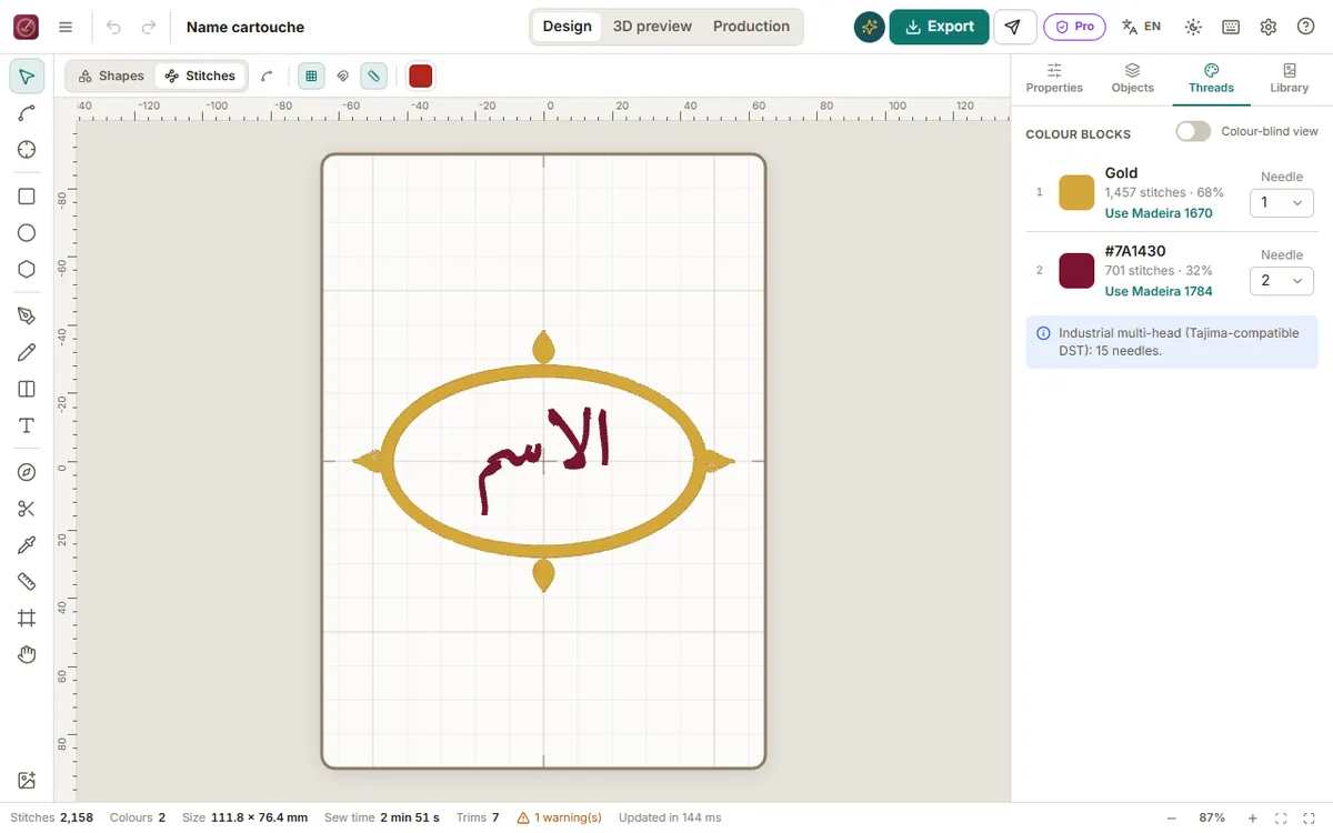
Size
- Satin lettering: keep letter bodies at least 8 mm high (measured on a letter like ه or م). Below that, dots merge into the letters.
- Small text (labels, 5–7 mm): use the simplest fonts and a running-stitch or narrow satin style; avoid velvet.
- Names on wedding cushions and karakou panels look best between 25 and 60 mm.
Fonts
- Naskh-style fonts are the most readable for names and dates.
- Thuluth / Diwani styles are decorative: use them large (40 mm or more) and give them space.
- Kufi styles have straight strokes that sew very cleanly, ideal for logos and small sizes.
- Tarz keeps the connections between letters (kashida, ligatures such as لا) and shapes the text correctly: never type isolated letters to "help" it.
Diacritics and dots
Diacritics (harakat) are optional; for names they are usually omitted. If you keep them, enlarge the text so that each mark is at least 2 mm wide.
Mixing Arabic and Latin
For a bilingual name ("Yasmine — ياسمين"), write each language in its own text object and align them: it gives better control over size and spacing than a single mixed line.
Before sewing
Open the 3D preview and zoom to 100 %: if the inside of a letter like ة or ف is filled, increase the size or reduce the density. On velvet and towels, always add a water-soluble topping.